And enjoy scrolling through more of my projects which are on my Instagram account!
Portfolio Website
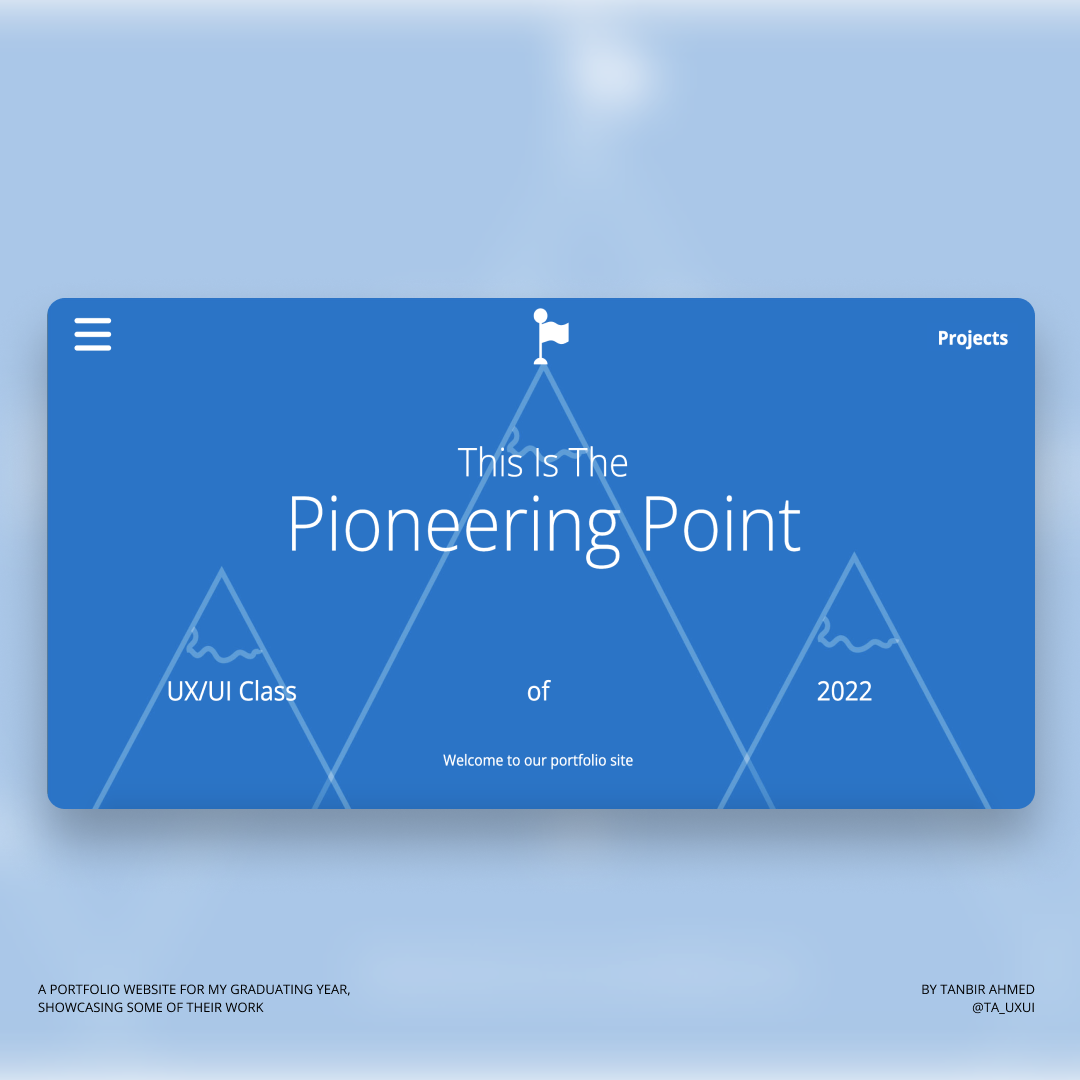
This Is The Pioneering Point
For this project I developed and built a stand-out professional identity and online portfolio for my whole graduating year. The aim was to create a site showing visual brand strength for impact, an innovative use of interaction/engagement on the web and disrupt elements of traditional web design.
As part of creating a class identity, I had to develop a strong brand personality for the year group which includes a class manifesto. I used language and visuals to develop an exciting narrative with a strong authentic story.
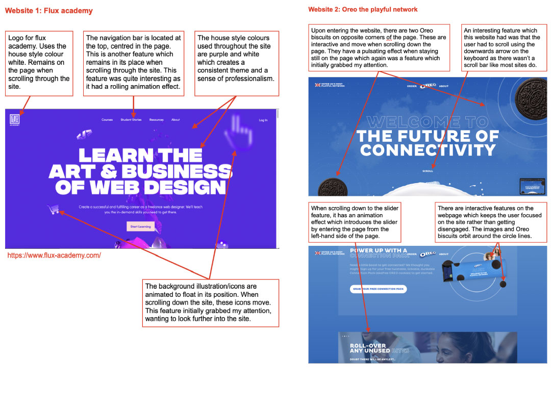
Research: Inspiration
I found a variety of different websites which were created using Webflow. Here are some websites which stood out to me which had an influence in my prototyping/planning stage. I annotated each screenshot with features that I had come across on each website which I wanted to implement in my own design.
Concept & Ideation
This section contains design plans for my websites layout and content. Below are sketches of how I planned for my website to look as well as a higher fidelity prototype for my websites layouts and contents which will was created using Adobe Illustrator. This section also contains the process taken in creating my site branding pack. I will take you through my chosen theme, icons which I used, colour palette, type face and font size. These ideas have all stemmed from the research conducted in the previous stage.
Contents:
My site has 11 individual pages which are all be hyperlinked so that users are able to navigate around with ease. Below are the list of pages:
Homepage (About page)
Profile page (Containing my personal projects)
Alexander (Projects page)
Aron (Projects page)
Emma (Projects page)
Huda (Projects page)
Jeenal (Projects page)
Karim (Projects page)
Kieran (Projects page)
Lovisa (Projects page)
Thea (Projects page)
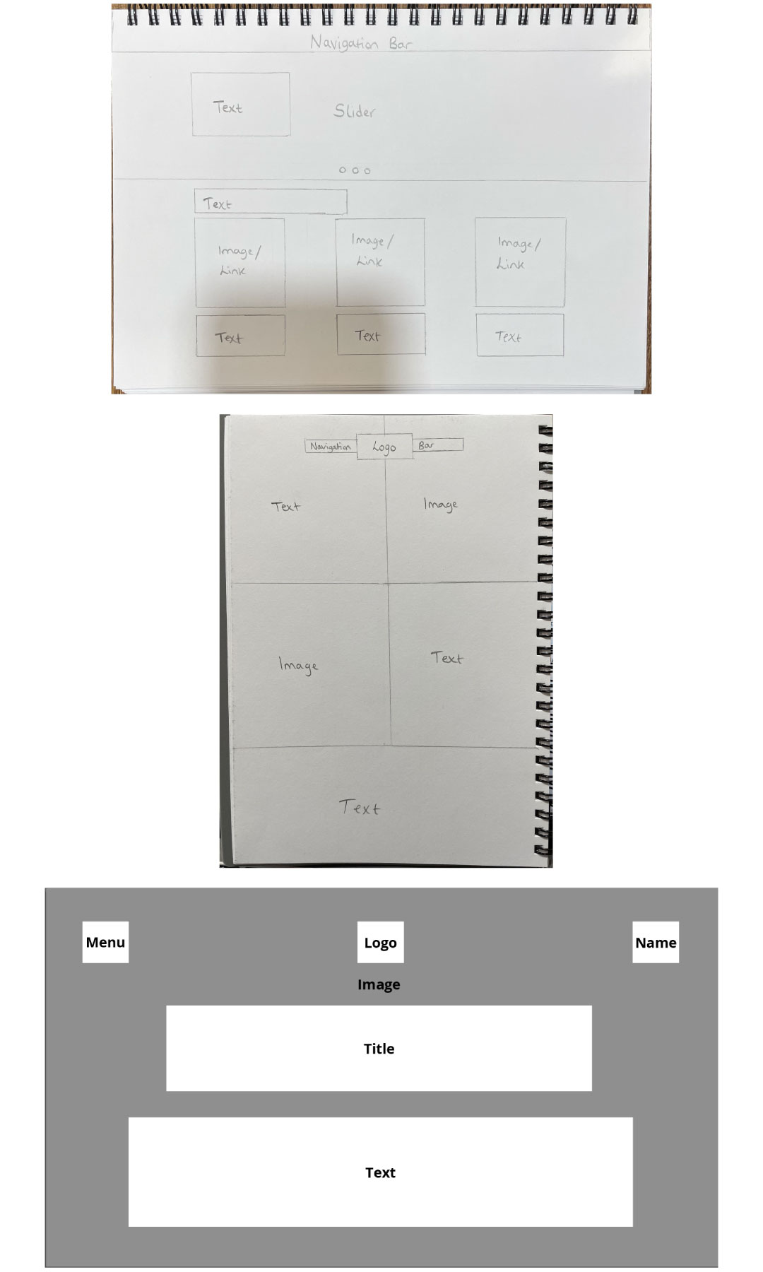
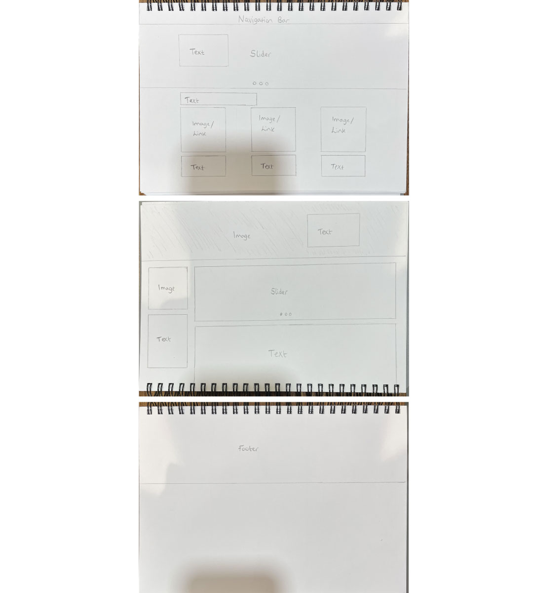
Lowfidelity prototype
These are images of the initial sketches which I had carried out which was the planning stage of my sites layout. These were rough sketches which helped me finalise my ideas on where I wanted certain features within my site to be displayed. This was later recorded in the high fidelity stage.
This design concept I had in mind for this website is to have most of the content all on one page. The only subpages within this design concept are the pages to showcase my work. The second sketch is a continuation of the page above which means the user will be able to see this part of the website when scrolling down.
The second page layout will be the same for every every member from my class. I decided to keep the layout the same to maintain consistency and a sense of professionalism as it will look organised. Having a different layout for each persons profile/work will confuse the user viewing my site as they will think they are viewing a different section of the site.
Highfidelity prototype
Through multiple sketch iterations, I created a higher fidelity mockup of the websites overall design using Adobe illustrator. I decided to create a whole new layout as I still wasn’t satisfied with the way features were arranged in the sketches.
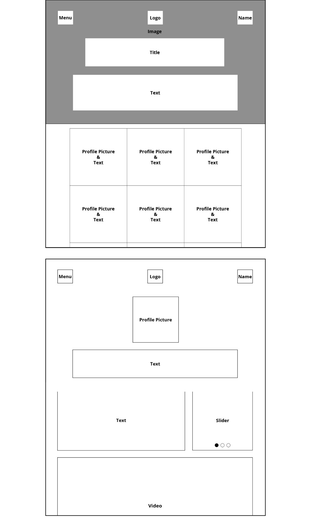
These are some of the many illustrations which I had created during the planning stage of the project. These mockups are here to give you a better visual understanding of how they looked.
The first sketch is part of the homepage. The second half of the sketch within the first sketch (below the grey page) is the continuation of the homepage. This means that when the user scrolls down the page, they will see the following content:
Profile Picture & Text: I planned for there to be 9 symmetrical boxes. This will contain a portrait image of each class member. The boxes will have two features. The first being, a button which is hyperlinked to a subpage that contains more information on a specific person, along with some of their previous/current projects. The second feature will be, when the user hovers their cursor over a persons portrait image, the image will become blurred or have a darker opacity and a brief description about the person will appear.
The second sketch is the profile page for each class member. Every persons profile page will consist of the same layout. The user will be able to access this page by clicking on the persons portrait picture (displayed on the homepage). This section shows the layout for the people who want a video embedded to their page.
Site branding pack
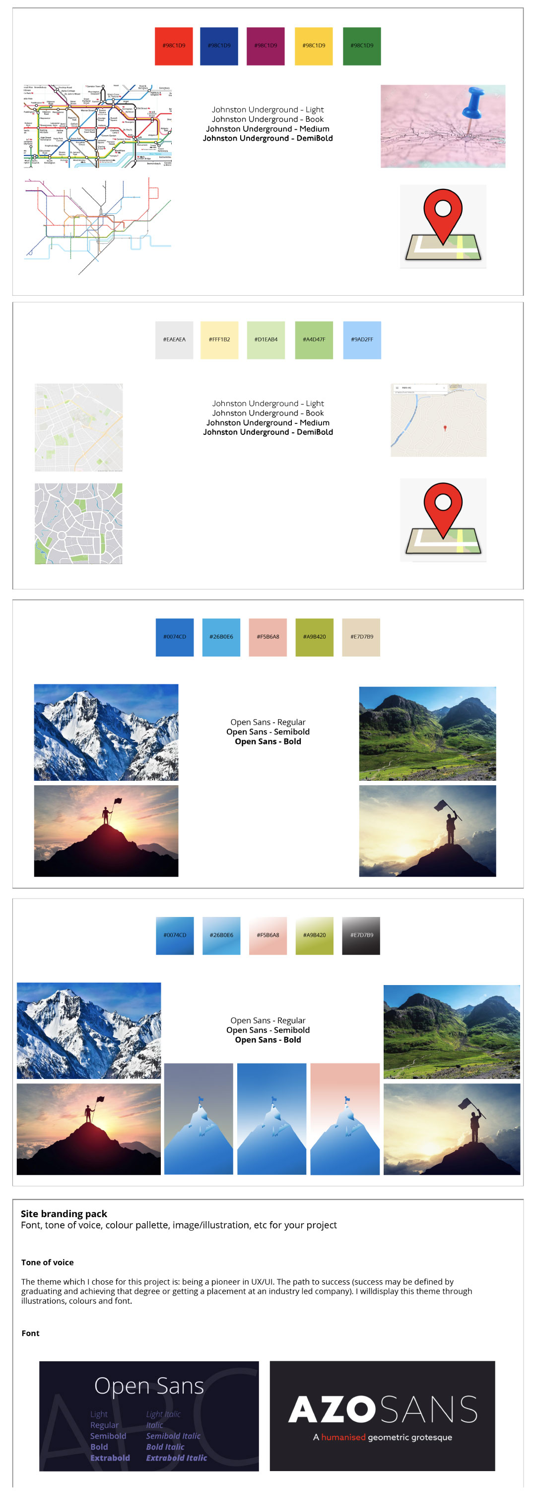
I conducted vigorous iterations to my site branding pack. Here is an example of the initial and final site branding pack I created.
The initial site branding map I created consisted of images of maps. This is because I thought this resembled/translated the word ‘pioneer’. We look at a map to see our journey to a destination. In our UX/UI course, we are pioneering our way through to industry led companies. The UX/UI course being our ‘journey’ and the industry practice being our destination. Therefore, I was looking for images of maps.
The use of images helped me in the second stage of completing my site branding pack as I had to look for colours. Instead of looking for a random colour palette like how I did initially. I used the same colours within the images. The use of the colours within the images begins to create a theme and a direction.
Choosing the typography for my site was also made easy as I had thought to use the same font type which is used within the transport for London maps.
However, looking at the outcome of this branding pack, I wasn’t satisfied with the font type or colours used. This is because the colours were all very different from each other which made me realise that they may not go well together if combine together in a site. The font type didn’t appeal to my liking either. Therefore I decided to go back and make some changes.
The second site branding pack (fourth page) I created had the same story concept. However, I had used different images to tell the same story. I used mountains as people can climb mountains, it can be quite difficult as there isn’t a set path to be able to walk to the top. I believed this translated my manifesto and the term ‘pioneer’ very well as I believe our journey in UX/UI has been difficult. We have encountered several problems and have managed to overcome them. It’s not an easy journey just like climbing a mountain. However, the destination is to reach the top of the mountain (this could be graduating, getting a job into an industry led company, getting the dream job).
I used the same steps which I had taken when creating the first branding pack, in choosing the colours. I used the colours seen in the images.
I had explored the range of fonts which google fonts offered. I chose to use a font-type where the readability of the text wouldn’t be effected despite the font weight or size. Open-sans stood out to me as it was formal and readable.
Final Outcome
Class Manifesto: This Is The Pioneering Point
The theme which I chose for this project is: being a pioneer in UX/UI. The term ‘Pioneer’ stood out to me as I believe it defined all my fellow peers within my course. I believe that on a design course such as UX/UI, we are required to always explore, come up with new and innovative designs and ideas for all projects we encounter. Therefore, I felt like this word best described us as a collective
The mountain illustration resembled our rocky path/journey to the top. The top of the mountain symbolises our end goal. Success! - whether that be Graduating or getting a placement at an industry led company…
Light Away
This project explores the potential of designing experiences for spatial environments, from exhibitions to public space, indoors and outdoors, with a variety of purposes. Challenged to create an immersive experience which tells a story through interaction, this project put my creative skills to the test as I was given some freedom in what I was able to create when the project was set.
I collaborated with Outernet for this project. This was a university project which was also a class challenge, to have the opportunity to showcase your final piece when Outernets new building would launch.
Research
To kickstart this project, I had to pick an area close to the Outernet site such as; Denmark street, soho square, Shoreditch, Chinatown, etc. Once I had chosen an area of interest, I had to research further into that specific location and essentially create an immersive experience related around that theme.
I chose to research into Chinatown as I felt as though the culture and history is so rich - which I thought, would make the ideating stage much easier for me!
Ideation
The Chinese culture believes:
A traditional dish are long noodles. If you want to live a long life, you shouldn’t cut the noodles while eating them.
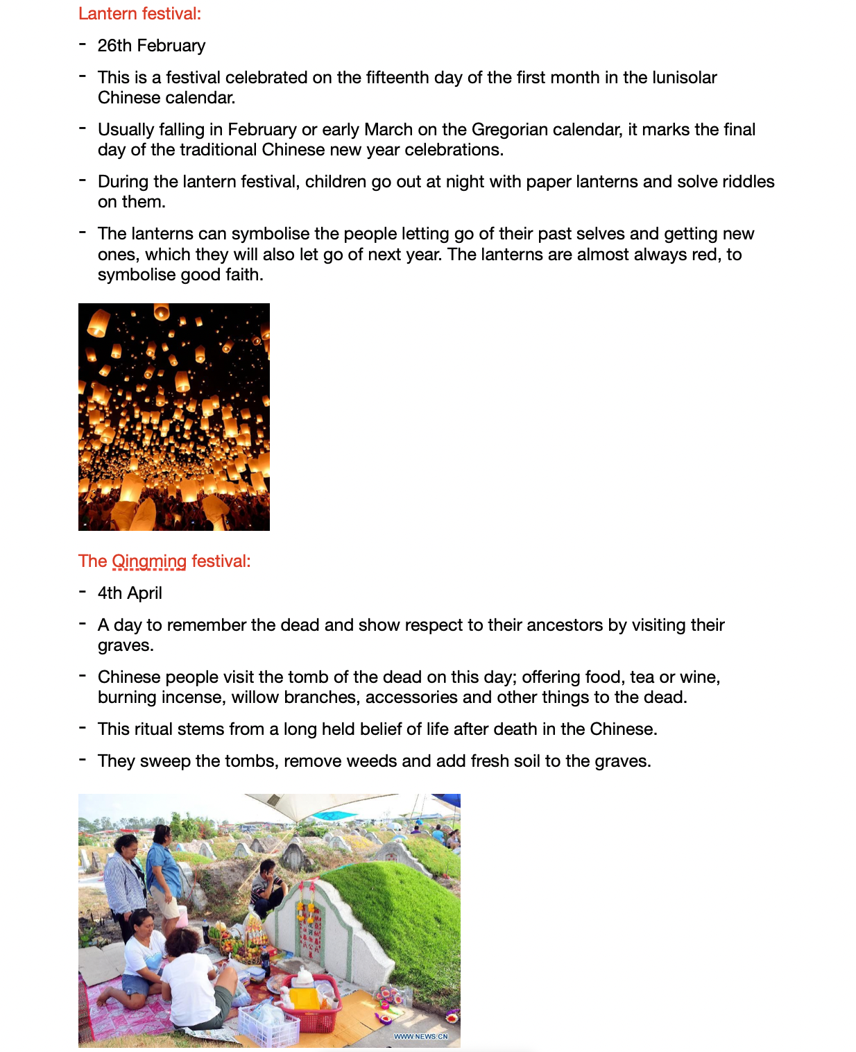
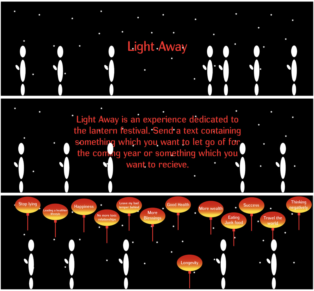
The lanterns can symbolise the people letting go of their past selves and getting new ones, which they will also let go of next year. The lanterns are almost always red, to symbolise good faith.
Based on these key insights, I had begun ideating. Below are some of my strongest concepts.
Trigger affect in the passage way of the street - Now Arcade section. Sensors to trigger different animations. This will again revolve around Chinese new year. For example, the user enters this section; firework animations will be displayed. Whilst they are walking through this passage, another sensor will trigger a different animation which will display the word, “Happy New Year” or “Chinese New Year”. Further down the passage, another sensor will trigger dancing dragons or themes related to Chinese New Year.
Create an interactive experience where people can compete against who can create the longest noodle. Game created using unity; two buttons and a one minute timer. Each button click, allows the noodle to grow longer. When the time limit ends, the scores will be displayed, showing who has won. A funny message will be displayed for both winner and loser. - This relates to the Chinese traditional dish being long noodles to represent long life.
Create an experience which involves users sending a text which is sent onto the screen onto a lantern which then floats up to the “sky” (up the screen). These messages could be something which they want to let go of or something they want in the future. This is to represent the lantern festival.
Visual Language
I applied research methods to explore ideas on narratives, information, identity, materials, and experience design. Through iterative testing and prototyping, I developed my skills in working with typography, imagery and content at different scales and perspectives.
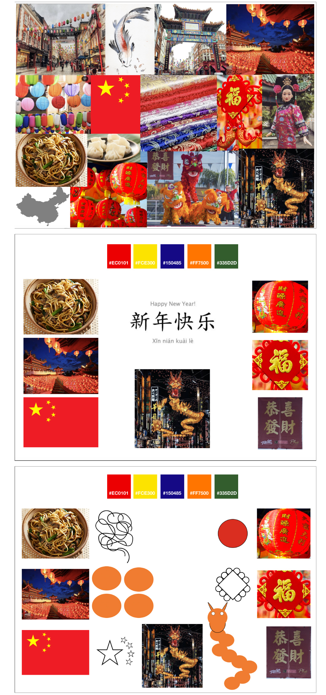
After analysing the visual language which I created, I noticed I had to change a lot of things as it wasn’t very strong. For instance, the images used are very typical within the Chinese culture. Seeing as I now know what I want to create for this project, it makes sense to analyse various different lanterns. The colour palette, type face and shapes created were very generic and simple. This made the overall outcome of the visual language weak.
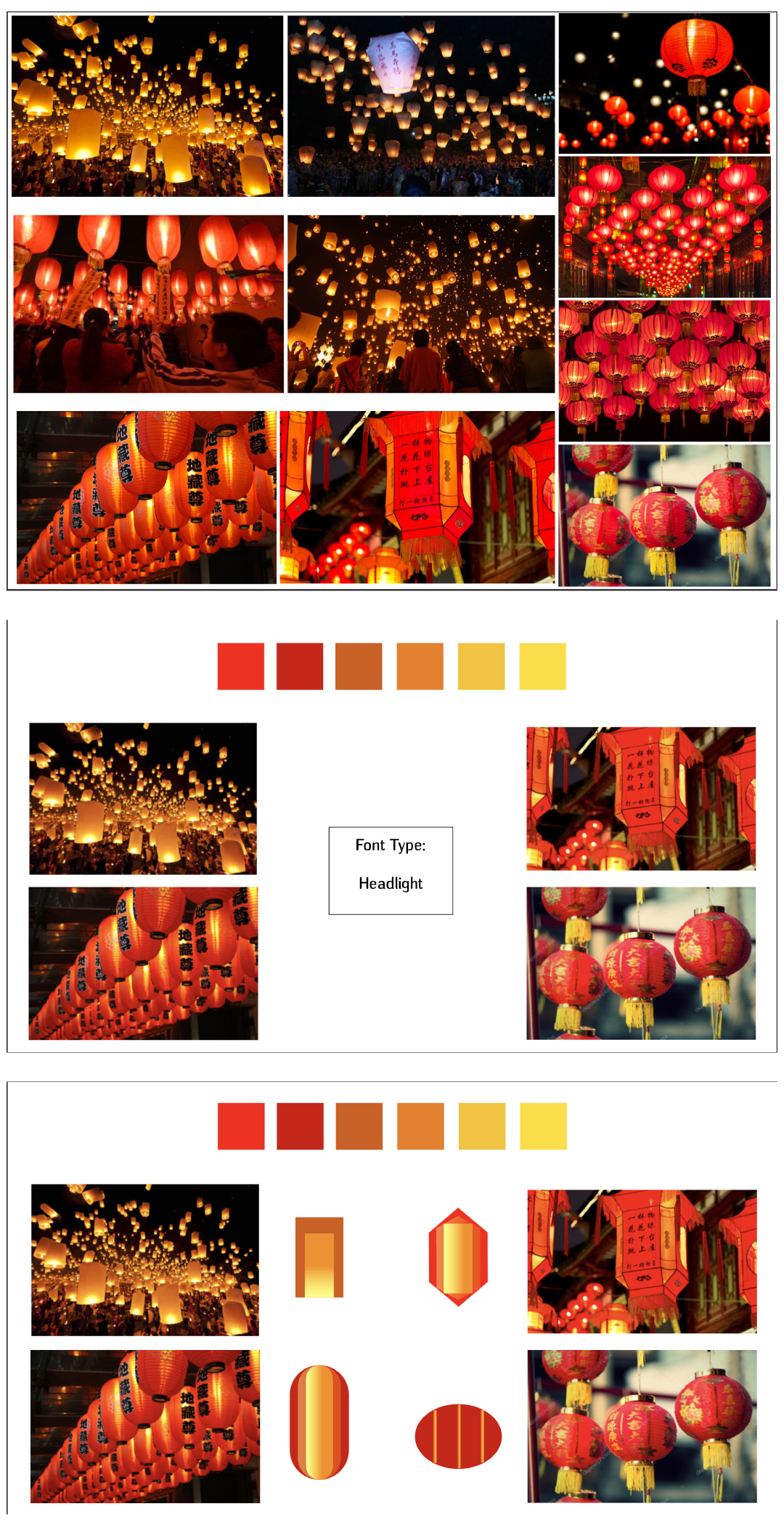
Visual Language: Iteration
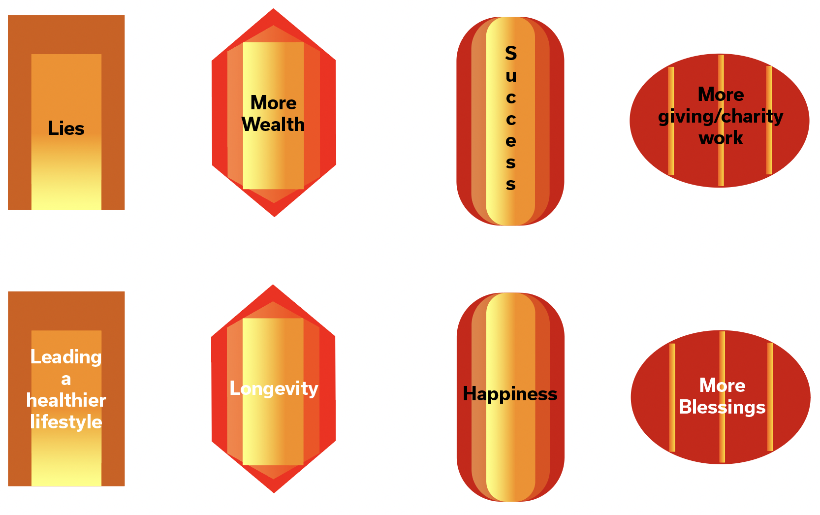
I decided to restart the visual language stage and focus on one aspect of the Chinese culture which is related to my project (lanterns - lantern festival). I created new shapes, using different gradients, chose different colours which related more closely to the images and also researched thoroughly into different type faces.
Experimentation
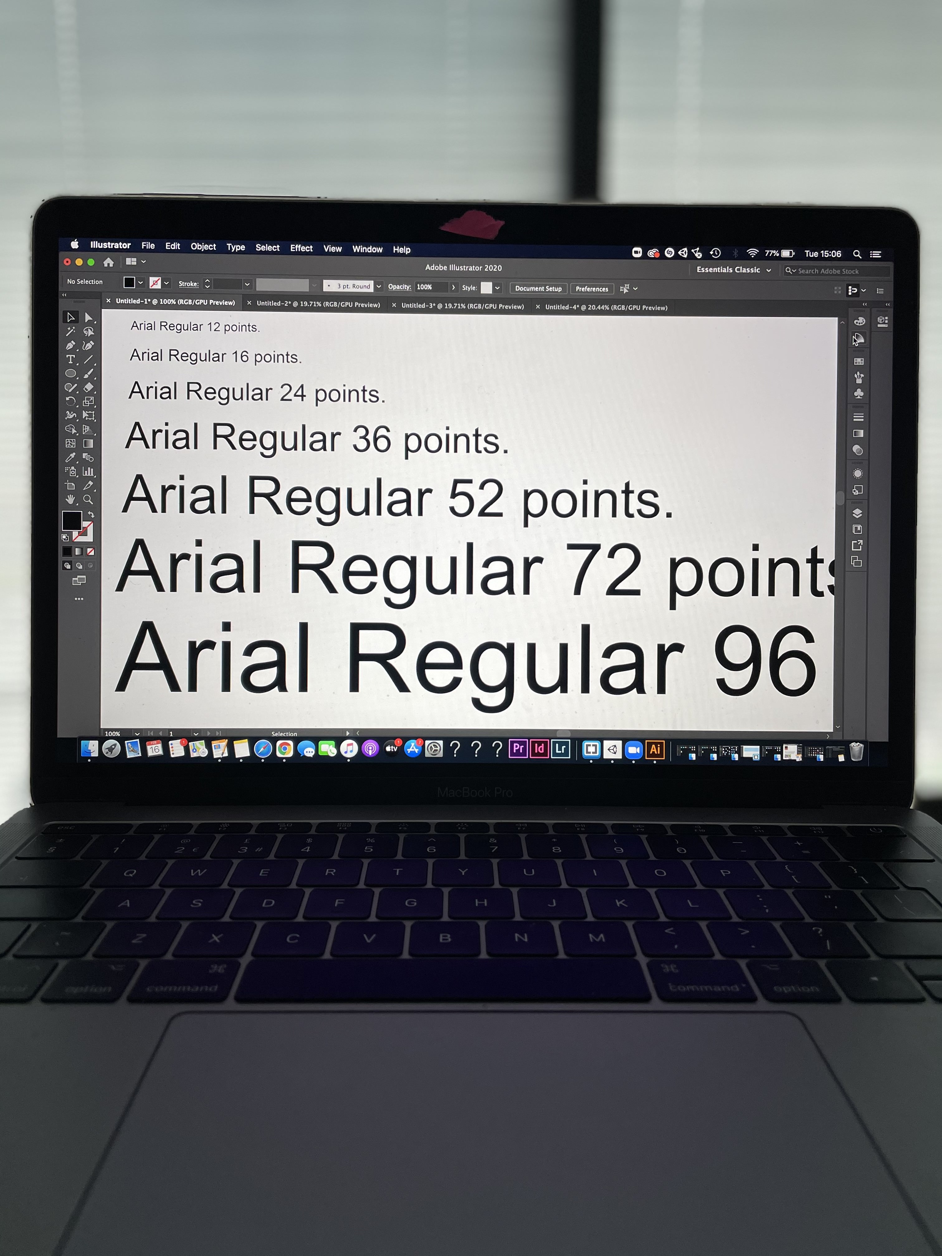
To begin the experimentation stage, I started with two tasks which involved scaling. The purpose of this task was to give me a good idea of how my type face will look on the screens in the now trending building.
Task 1:
In illustrator, create a 1000mm x 1000mm canvas, 300DPI RGB. Set your view to 100%. Create text at different sizes and see how readable it is from different distances.
Find the correct type size and distance to read a paragraph of text.
How far do you expect people to stand from the screen?
What happens if you change typeface?
What happens if you change colours?
Consider larger introduction text, detailed information, additional text styles you might need.
Task 2:
In Illustrator, design a large scale typographic entrance/introduction to your experience. Mock this up with a person to help convey scale. Use the documents from Outernet to establish the size of the space.
Some more experimentation...
Here, I was experimenting with how I could place text onto the lanterns. I thought this would give me a good visual understanding of how I wanted the text to be placed. During this process, I had realised that two of the lanterns (first and fourth lantern on the first row) did not look very nice with a black font colour. Therefore, I created a second row consisting of lanterns using a white font colour. This was to test the readability of the text against the lanterns in the background.
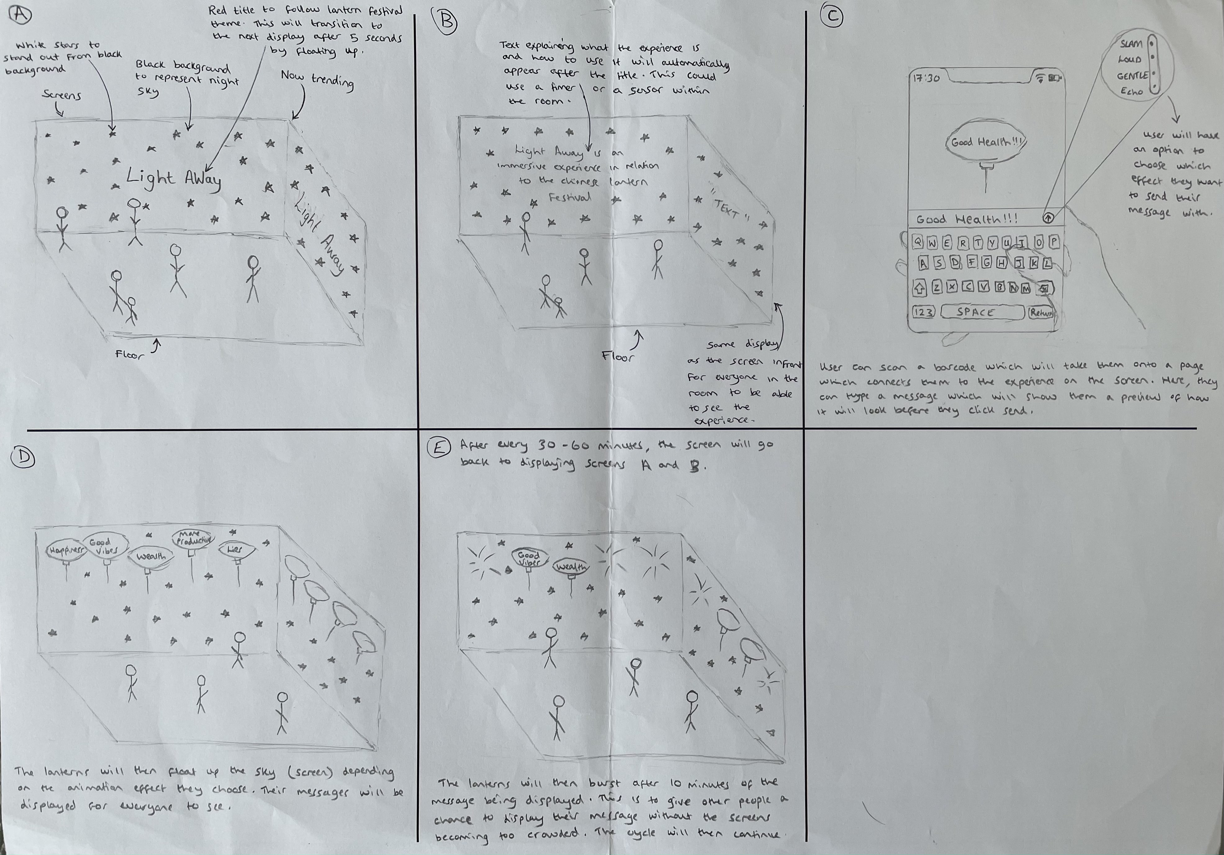
Storyboard
In the storyboard I showed how the experience would work. This is to show people my vision with this project and how I wanted every feature to work. I lettered each section to show users the order in which this experience goes in.
Low fidelity
The low fidelity consisted of sketching. I missed the concept of storyboarding by annotating each stage with text. Therefore, I created another storyboard with slight tweaks to the one i created here.
High fidelity
I created a higher fidelity story board which used less text. I made changes such as;
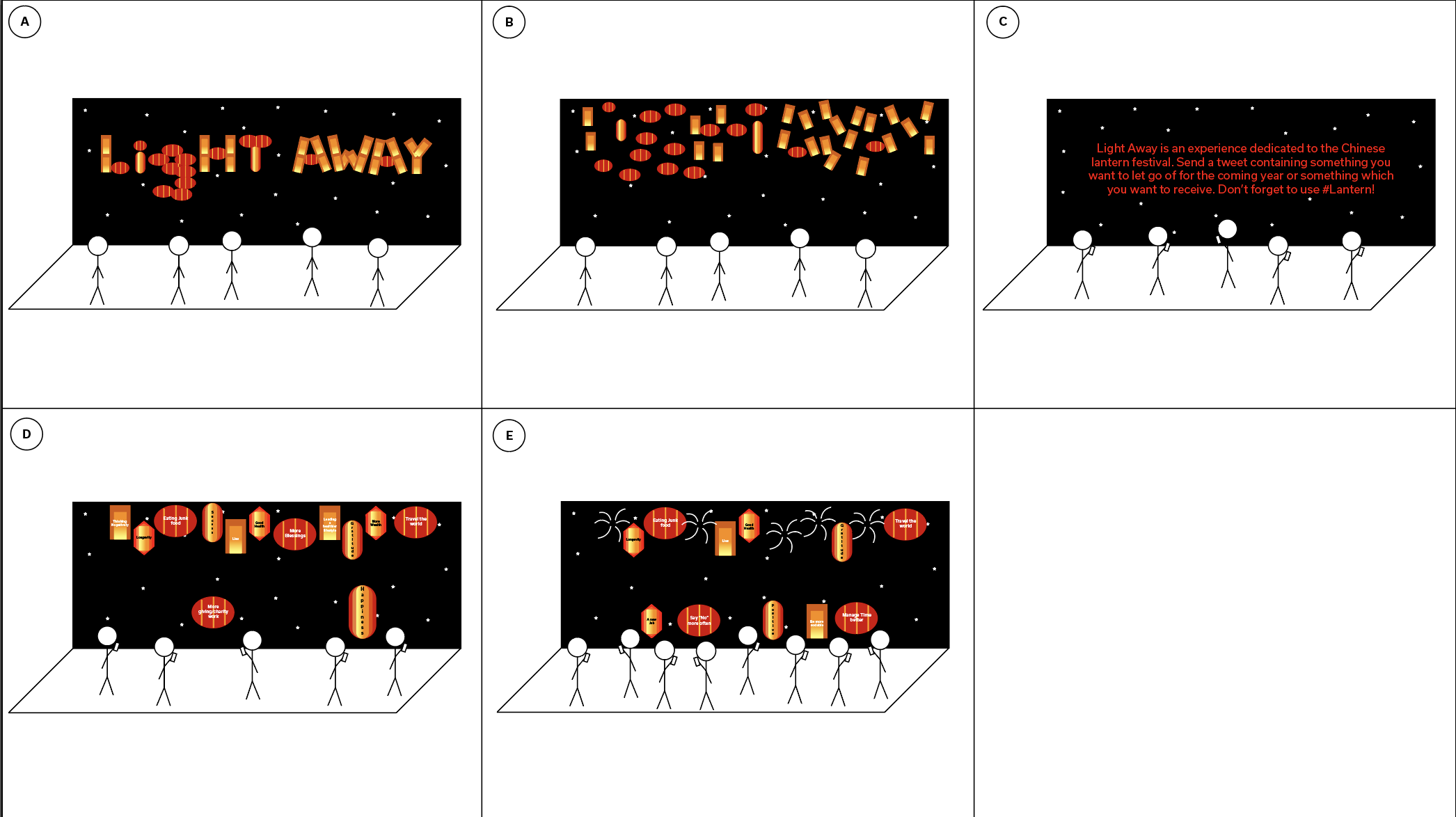
1) The title displayed in section A will be made from lanterns which will then float up to the sky and transition into infographic text as you can see in section D.
2) I also changed the information displayed on the screen in section C. Here I added information about sending a tweet. This is because I decided to change the way in which users can interact with my experience.
Outcome
The interactions I employed drives progression through the story, enabling the visitor to understand and experience the story.
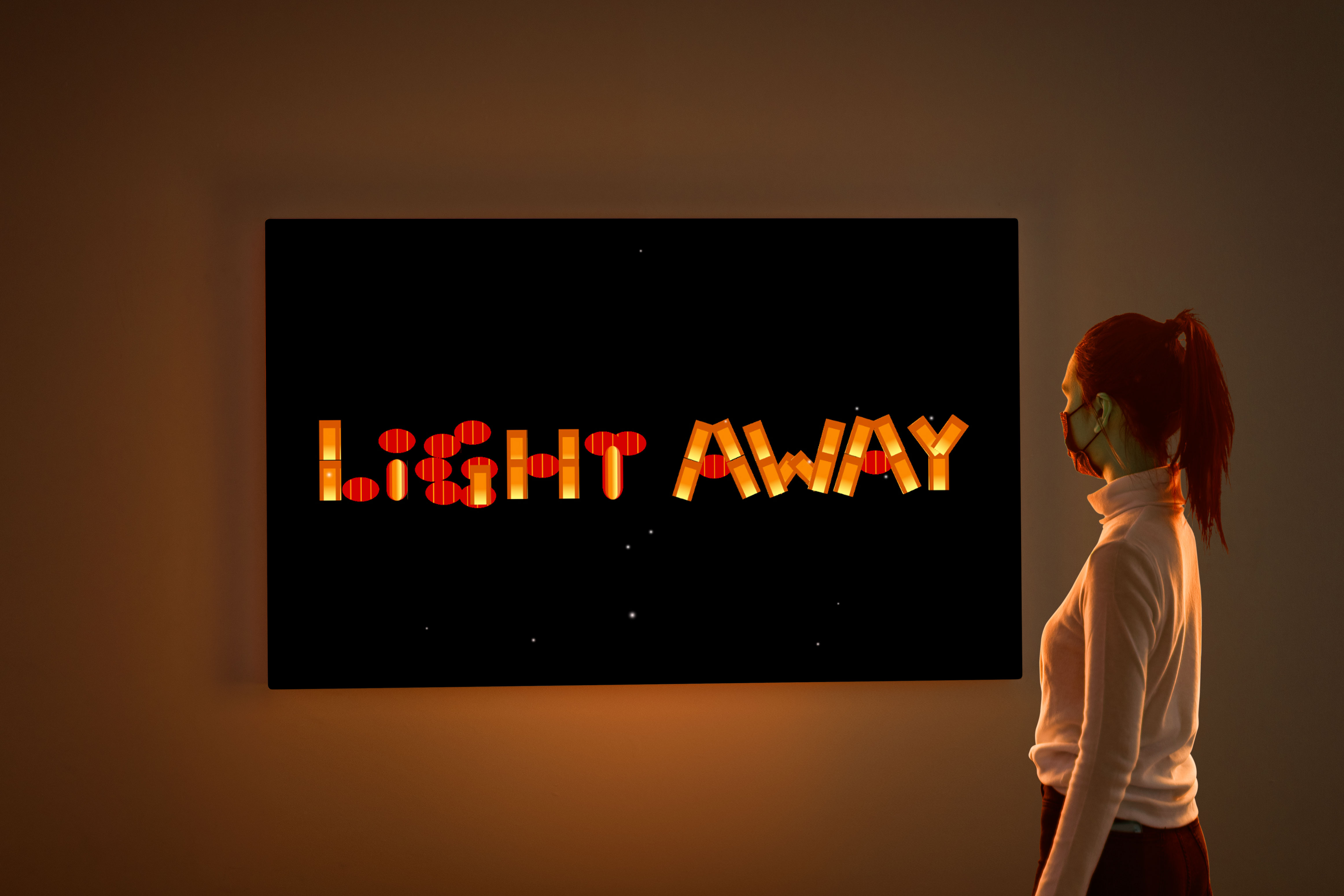
Light Away is an immersive experience which stems from the Chinese lantern festival. On the Chinese lantern festival, the lanterns symbolise the people letting go of their past selves and getting new ones, which they can also let go of the following year. The lanterns are almost always red to symbolise good faith. So, what does this have to do with the lantern festival?
Light Away allows people to post a tweet with a short message of what they would like to attract in the coming year or something which they would like to let go of. This message will be displayed on a lantern which will slowly float up the screen. To carry the lantern festival theme through my project, the main colours used within my immersive experience consisted of the colour red.
The twitter API function is the core function within my immersive experience. This function allows my project within unity to listen out to specific hashtags which will then use those hashtags to trigger a relevant response. In this instance, if the hashtag is used, the users message will be displayed on a lantern and will be displayed on the screen.
(My project was one of two projects chosen by Outernet. Unfortunately, due to this project taking place in early 2021, Covid restrictions had prevented us from being able to showcase our work at Outernets space.)